


DOKTER & OPVANG CASE STUDY
Designing a referral tool for vulnerable patients.
Designing a referral tool for vulnerable patients.
A referral tool to easily guide 20+ emergency doctors in helping vulnerable patients take the right next step after medical treatment.

Overview
I collaborated with a design team to create Dokter & Opvang (D&O), a digital referral platform that helps emergency department at Mijn OLVG in Amsterdam quickly identify and connect 3U (Uninsured, Unhoused and Undocumented) patients to appropriate after-care services such as shelters and food banks.
Through research and interviews with emergency department staff at OLVG Oost, I uncovered a critical gap: While patients receive medical treatment, there is no structured way to guide them towards aftercare. I translated these insights into a solution that combines a digital search platform that enables staff to find suitable services based on availability, location, and patient needs.
Goals:
Help ED staff quickly find relevant aftercare services for 3U individuals.
Improve access to aftercare information through a clear and efficient digital platform.
Design a simple and privacy-conscious referral experience for emergency departments.
My Role:
UX/UI Designer
Responsibilities:
End-to-End UX & UI Design Process, Design System
COLLABORATORS
Ayu Koene, Matin Mohammadi, Františka Jirásková.
TIMELINE:
Q1 2025 - Q4 2025
The challenge
Emergency department staff often struggle to quickly find reliable aftercare services for 3U individuals after treatment, leading to delays and limited support beyond medical care.
USER NEED
Help emergency staff quickly find trustworthy, accessible, and relevant aftercare information without adding complexity to their workflow.

PROBLEM TO SOLVE
How might we design digital tools and platforms that deliver accessible, compassionate, and reliable healthcare to unhoused individuals?
How might we design digital tools and platforms that deliver accessible, compassionate, and reliable healthcare to unhoused individuals?
How might we design digital tools and platforms that deliver accessible, compassionate, and reliable healthcare to unhoused individuals?
RESEARCH
Gathering insights.
Gathering insights.
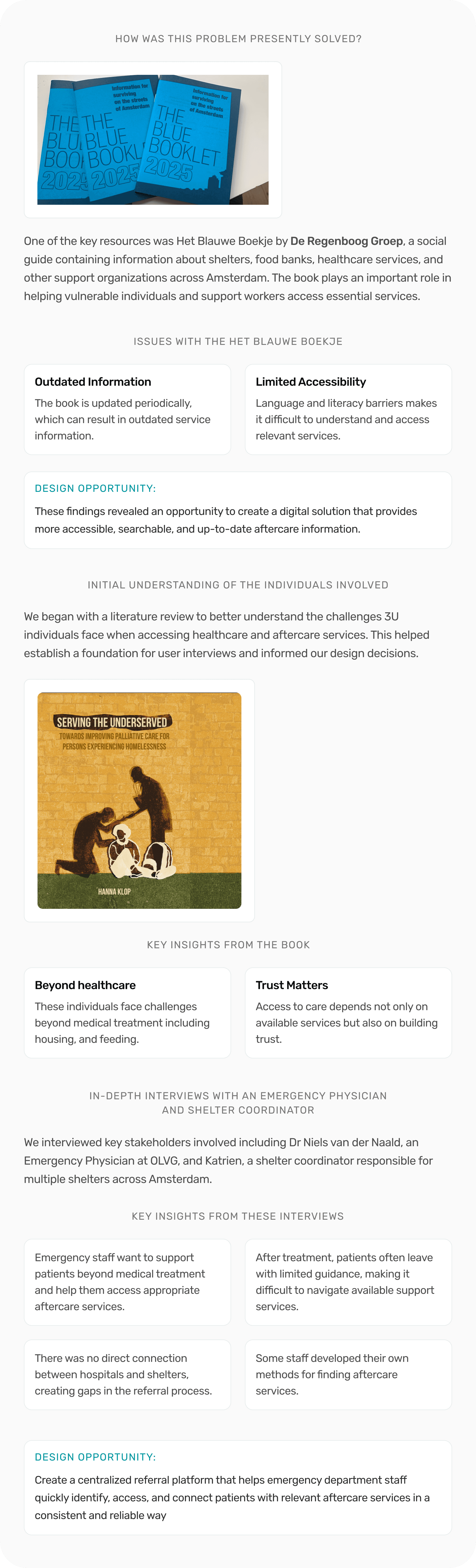
Research revealed that emergency department staff relied on physical guidebooks and scattered online resources to find aftercare services. The goal was to reduce the time spent searching across multiple websites and resources by creating a centralized and searchable experience.
Research revealed that emergency department staff relied on physical guidebooks and scattered online resources to find aftercare services. The goal was to reduce the time spent searching across multiple websites and resources by creating a centralized and searchable experience.
Key insights
DOCTOR CONFIDENCE IN PLATFORM USE
Emergency departments are often the first point of contact for these patients, but the staff don't have the tools to access aftercare services.
COLLABORATION GAPS SLOW AFTERCARE ACCESS
Research revealed limited coordination between hospitals and social service providers, making it harder for ED staff to connect 3U individuals with the appropriate long-term support.
EXISTING SOLUTIONS ARE DIFFICULT TO MAINTAIN
Current resources, such as physical guidebooks, can quickly become outdated, reducing the reliability of important service info.
AFTERCARE REFERRALS ARE INCONSISTENT
ED staff often rely on personal knowledge and informal methods to connect patients with aftercare services, resulting in inconsistent referral experiences.
Key insights
DOCTOR CONFIDENCE IN PLATFORM USE
Emergency departments are often the first point of contact for these patients, but the staff don't have the tools to access aftercare services.
EXISTING SOLUTIONS ARE DIFFICULT TO MAINTAIN
Current resources, such as physical guidebooks, can quickly become outdated, reducing the reliability of important service info.
AFTERCARE REFERRALS ARE INCONSISTENT
ED staff often rely on personal knowledge and informal methods to connect patients with aftercare services, resulting in inconsistent referral experiences.
COLLABORATION GAPS SLOW AFTERCARE ACCESS
Research revealed limited coordination between hospitals and social service providers, making it harder for ED staff to connect 3U individuals with the appropriate long-term support.
Addressing user's pain points.
Research revealed challenges in accessing aftercare information, coordinating with service providers, and supporting referrals for 3U individuals.
Research revealed challenges in accessing aftercare information, coordinating with service providers, and supporting referrals for 3U individuals.
1. SIMPLIFYING SERVICE DISCOVERY
Staff needed a faster way to find relevant aftercare services.
IMPROVING CARE COORDINATION
Staff needed better visibility into available support services.
IMPROVING REFERRALS
Staff needed a consistent way to connect patients with aftercare services.
1. SIMPLIFYING SERVICE DISCOVERY
Staff needed a faster way to find relevant aftercare services.
IMPROVING CARE COORDINATION
Staff needed better visibility into available support services.
IMPROVING REFERRALS
Staff needed a consistent way to connect patients with aftercare services.
HOW MIGHT WE
How might we help emergency department staff quickly find and refer appropriate aftercare services for 3U individuals in a simple and accessible way?
How might we help emergency department staff quickly find and refer appropriate aftercare services for 3U individuals in a simple and accessible way?
How might we help emergency department staff quickly find and refer appropriate aftercare services for 3U individuals in a simple and accessible way?
IDEATION
Developing concepts
Developing concepts
Research revealed that emergency department staff relied on physical guidebooks and scattered online resources to find aftercare services. The goal was to reduce the time spent searching across multiple websites and resources by creating a centralized and searchable experience.
Research revealed that emergency department staff relied on physical guidebooks and scattered online resources to find aftercare services. The goal was to reduce the time spent searching across multiple websites and resources by creating a centralized and searchable experience.

USER TESTING
Testing my solutions.
Testing my solutions.
Through multiple design iterations and usability testing sessions with Dr. Niels van der Naald, an Emergency Physician at OLVG Amsterdam, we gathered feedback that helped simplify the experience, reduce unnecessary complexity, and improve how aftercare services were discovered and accessed.
Through multiple design iterations and usability testing sessions with Dr. Niels van der Naald, an Emergency Physician at OLVG Amsterdam, we gathered feedback that helped simplify the experience, reduce unnecessary complexity, and improve how aftercare services were discovered and accessed.

First round of user testing
Our initial concept was to collect the 3U individuals' personal information to match them with appropriate services. During testing, users raised concerns around privacy and highlighted that much of this information had already been collected by the Emergency department.
Key design insights for the next iteration:
Remove unnecessary data collection from the platform.
Focus on a simpler and more efficient workflow for emergency departments.
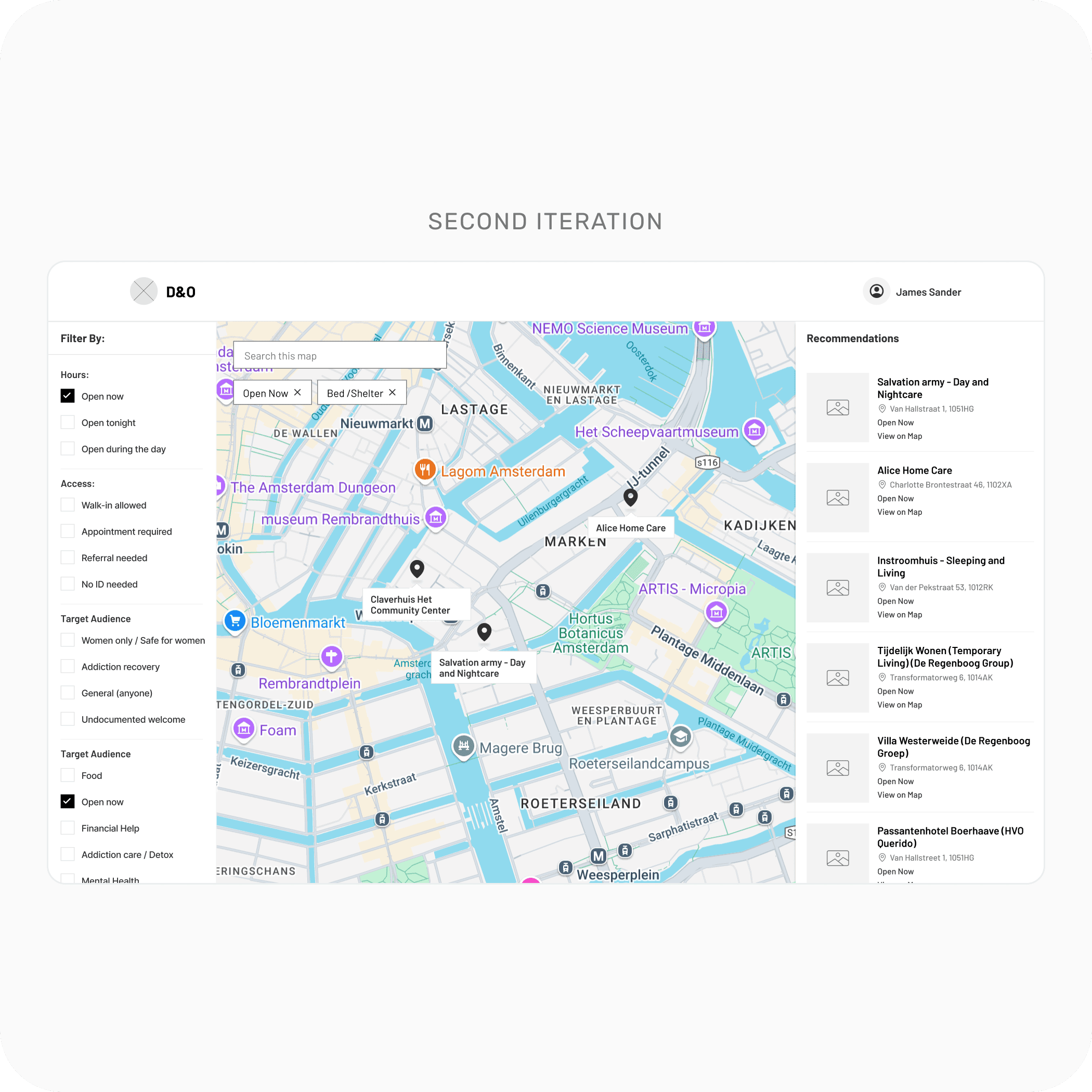
Second round of user testing
The second iteration removed personal data collection and focused on displaying relevant aftercare services with a map. Still, testing revealed that the interface contained too much information for ED staff to identify the right service quickly.
Key design insights for the next iteration:
Prioritize the most important information: available services
Reduce information overload on the interface
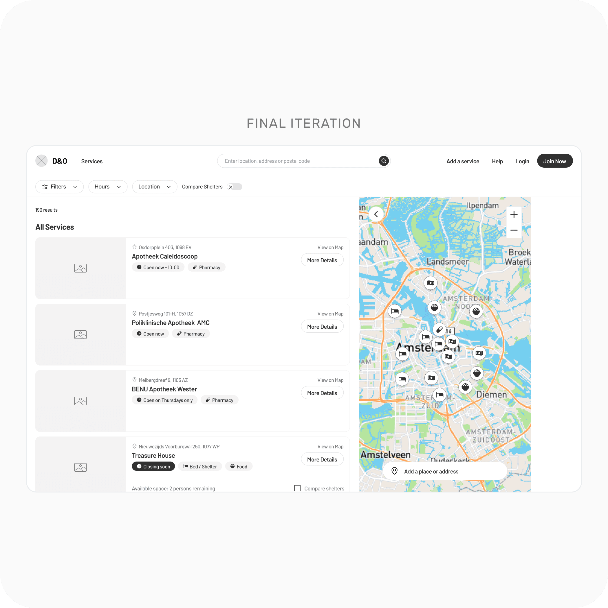
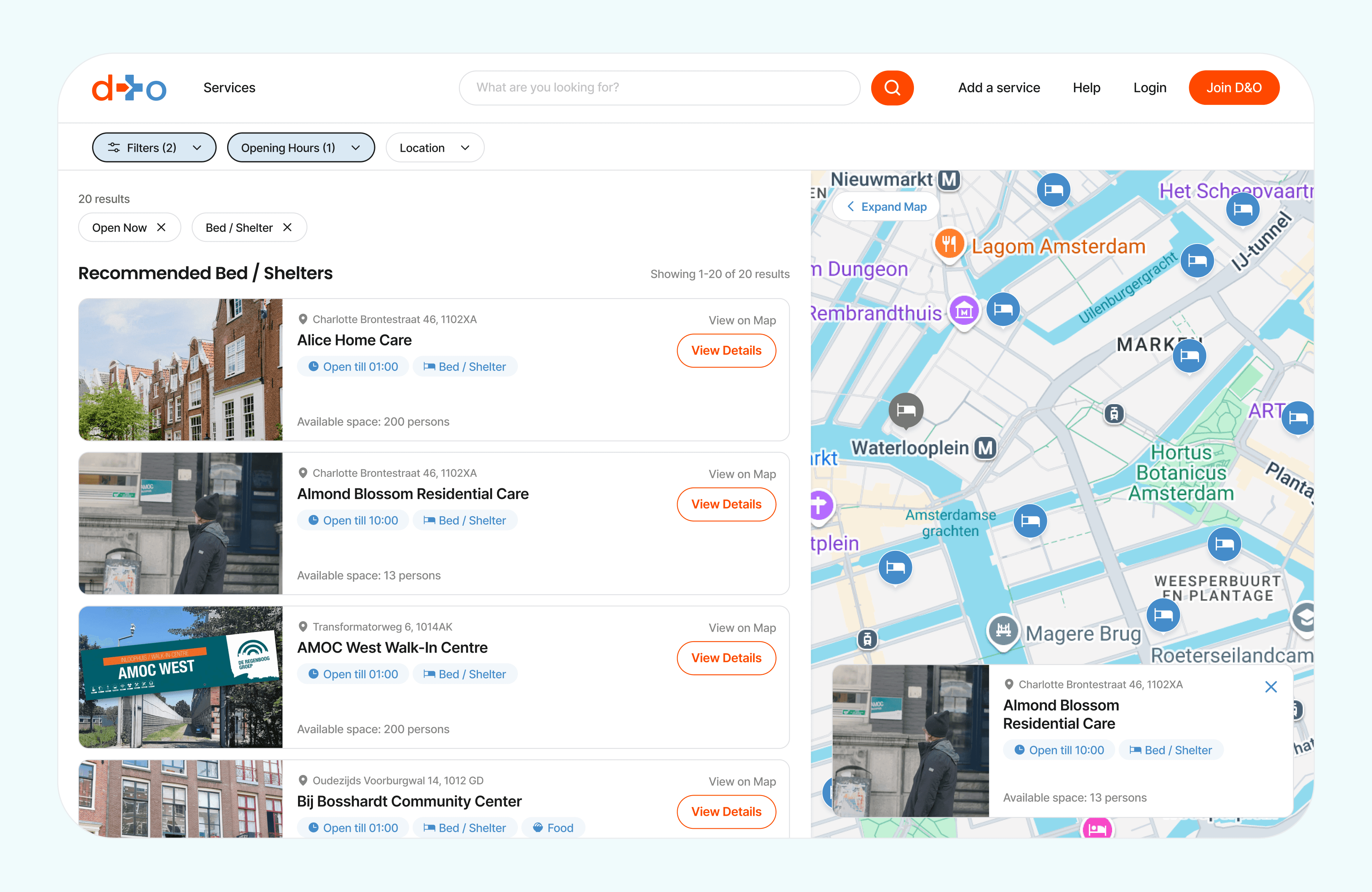
Final round of user testing
The final iteration simplified the experience by displaying available services alongside a map view and moving filter options into a dedicated pop-up menu.
During testing, Niels was able to find services more efficiently, but he did not immediately notice that the map could be resized, highlighting an opportunity to improve the visibility of this interaction.
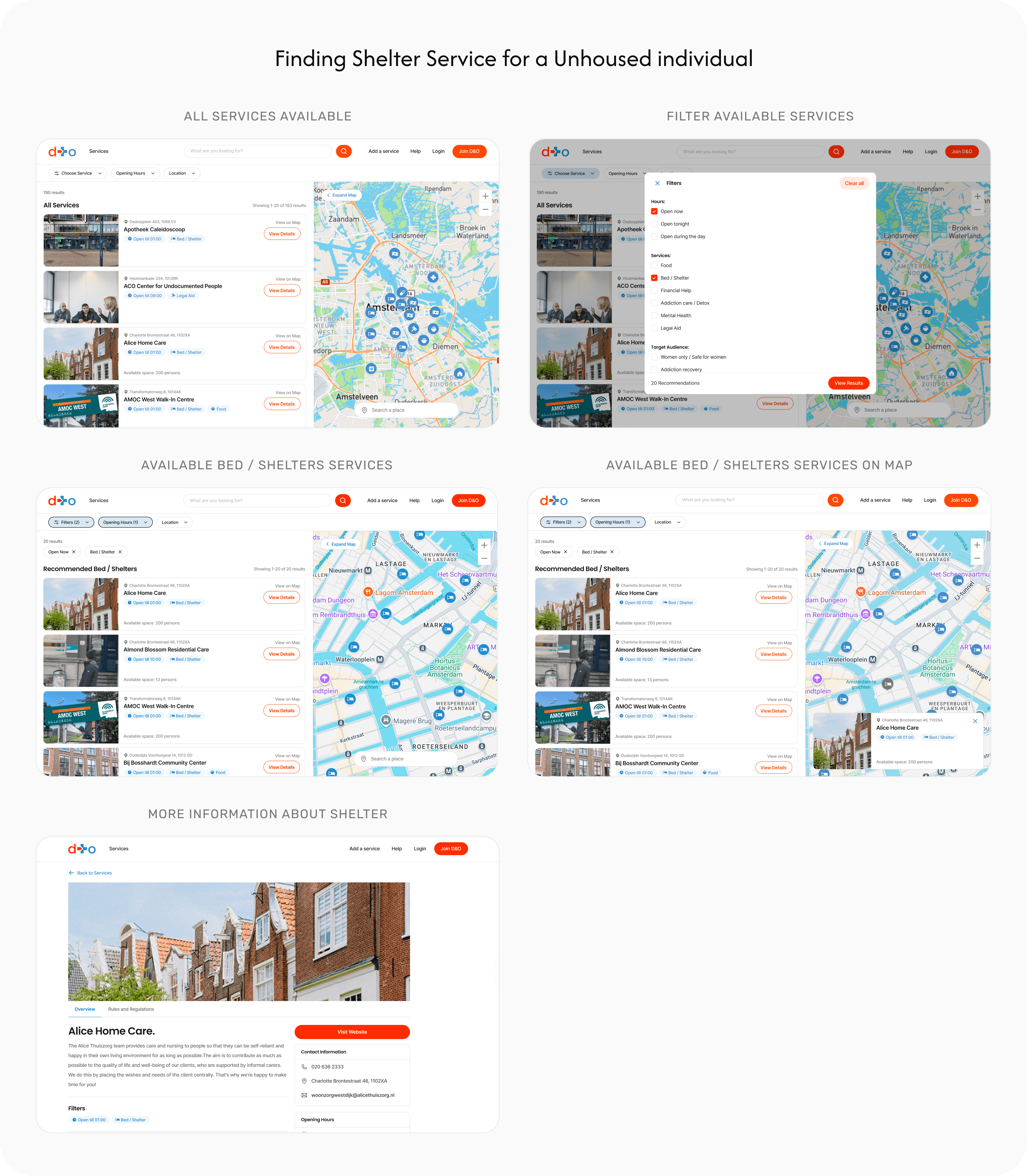
FINAL DESIGN
The MVP flow
The MVP flow
Through multiple iterations and usability testing with emergency doctors, we refined the platform into a simpler and more efficient referral experience focused on reducing information overload and improving access to relevant services.
Through multiple iterations and usability testing with emergency doctors, we refined the platform into a simpler and more efficient referral experience focused on reducing information overload and improving access to relevant services.

IMPACT
The results
The results
The results
Through continuous testing and iteration, the platform evolved into a clearer and more efficient referral experience, receiving strong positive feedback from emergency doctors and healthcare professionals.
Through continuous testing and iteration, the platform evolved into a clearer and more efficient referral experience, receiving strong positive feedback from emergency doctors and healthcare professionals.
“This would make it much easier to quickly find the right service for patients after treatment.”
“This would make it much easier to quickly find the right service for patients after treatment.”
“This would make it much easier to quickly find the right service for patients after treatment.”
Usability Testing Participant
Usability Testing Participant
What I learnt from this project
Designing with privacy builds trust
I learned that designing for vulnerable users requires balancing functionality with privacy. Removing personal data collection helped create a more trustworthy and accessible experience for both ED staff and 3U individuals.
Small solutions can create real impact
This project taught me that simple design improvements can support high-pressure environments in meaningful ways. Improving access to aftercare information has the potential to help ED staff better support 3U individuals after treatment.
Iteration improves clarity and usability
Testing the platform with users showed me how important continuous iteration is in simplifying complex workflows. Each round of feedback helped reduce information overload and improve clarity for emergency staff.
NEXT CASE STUDY
Rethinking the traditional pharmacy experience.
A digital pharmacy experience that simplifies how users search, understand, and purchase medications online with confidence.

RESEARCH
Gathering insights
Research revealed that emergency department staff relied on physical guidebooks and scattered online resources to find aftercare services. The goal was to reduce the time spent searching across multiple websites and resources by creating a centralized and searchable experience.
Key insights
DOCTOR CONFIDENCE IN PLATFORM USE
Emergency departments are often the first point of contact for these patients, but the staff don't have the tools to access aftercare services.
EXISTING SOLUTIONS ARE DIFFICULT TO MAINTAIN
Current resources, such as physical guidebooks, can quickly become outdated, reducing the reliability of important service info.
AFTERCARE REFERRALS ARE INCONSISTENT
ED staff often rely on personal knowledge and informal methods to connect patients with aftercare services, resulting in inconsistent referral experiences.
COLLABORATION GAPS SLOW AFTERCARE ACCESS
Research revealed limited coordination between hospitals and social service providers, making it harder for ED staff to connect 3U individuals with the appropriate long-term support.
Answering the key questions.
Insights from this analysis informed key design decisions, ensuring scalability and ease of use.
1. SIMPLIFYING SERVICE DISCOVERY
Staff needed a faster way to find relevant aftercare services.
IMPROVING CARE COORDINATION
Staff needed better visibility into available support services.
IMPROVING REFERRALS
Staff needed a consistent way to connect patients with aftercare services.
FINAL DESIGN
The MVP flow
The final MVP delivered a seamless booking experience that helped users easily discover, book, and manage trusted local professionals.
What I learnt from this project
Designing with privacy builds trust
I learned that designing for vulnerable users requires balancing functionality with privacy. Removing personal data collection helped create a more trustworthy and accessible experience for both ED staff and 3U individuals.
Iteration improves clarity and usability
Testing the platform with users showed me how important continuous iteration is in simplifying complex workflows. Each round of feedback helped reduce information overload and improve clarity for emergency staff.
Small solutions can create real impact
Testing the platform with users showed me how important continuous iteration is in simplifying complex workflows. Each round of feedback helped reduce information overload and improve clarity for emergency staff.
Designing with privacy builds trust
I learned that designing for vulnerable users requires balancing functionality with privacy. Removing personal data collection helped create a more trustworthy and accessible experience for both ED staff and 3U individuals.
Small solutions can create real impact
This project taught me that simple design improvements can support high-pressure environments in meaningful ways. Improving access to aftercare information has the potential to help ED staff better support 3U individuals after treatment.
Iteration improves clarity and usability
Testing the platform with users showed me how important continuous iteration is in simplifying complex workflows. Each round of feedback helped reduce information overload and improve clarity for emergency staff.
What I learnt from this project
IDEATION
Developing concepts
Research revealed that emergency department staff relied on physical guidebooks and scattered online resources to find aftercare services. The goal was to reduce the time spent searching across multiple websites and resources by creating a centralized and searchable experience.
Co-design credit:
Mapping the booking journey
To create a seamless booking experience, I mapped the complete user journey from service discovery to project creation:
Search Services: Allow users to find the services they need from the home screen quickly.
Browse Available Professionals: Present relevant professionals based on the user's search and location.
Provide Project Details: Collect key information, including project requirements, duration, and the number of professionals needed.
Secure Payment: Enable a straightforward payment process with transparent pricing.
Job Creation: Confirm the booking and create the project, allowing users to track and manage it afterward.
NEXT CASE STUDY
Rethinking the traditional pharmacy experience.
A digital pharmacy experience that simplifies how users search, understand, and purchase medications online with confidence.
NEXT CASE STUDY
Rethinking the traditional pharmacy experience.
A digital pharmacy experience that simplifies how users search, understand, and purchase medications online with confidence.
USER TESTING
Testing my solutions.
Through multiple design iterations and usability testing sessions with Dr. Niels van der Naald, an Emergency Physician at OLVG Amsterdam, we gathered feedback that helped simplify the experience, reduce unnecessary complexity, and improve how aftercare services were discovered and accessed.
First round of user testing
Our initial concept was to collect the 3U individuals' personal information to match them with appropriate services. During testing, users raised concerns around privacy and highlighted that much of this information had already been collected by the Emergency department.
Key design insights for the next iteration:
Remove unnecessary data collection from the platform.
Focus on a simpler and more efficient workflow for emergency departments.
Second round of user testing
The second iteration removed personal data collection and focused on displaying relevant aftercare services with a map. Still, testing revealed that the interface contained too much information for ED staff to identify the right service quickly.
Key design insights for the next iteration:
Prioritize the most important information: available services
Reduce information overload on the interface
Final round of user testing
The final iteration simplified the experience by displaying available services alongside a map view and moving filter options into a dedicated pop-up menu.
During testing, Niels was able to find services more efficiently, but he did not immediately notice that the map could be resized, highlighting an opportunity to improve the visibility of this interaction.